Leveraging Data Visualization for Improved Analytics

Data visualization plays an integral role in the analytics pipeline, and it’s an essential skill to have for quality, advanced analytics used by data scientists, artificial intelligence experts, and analysts alike. Data has long been the “residue of business,” able to be seen in virtually every aspect of business operations, from accounting ledgers and purchase receipts to stock shelves. However, data is useless if it isn’t analyzed and put into a clear and easily digestible format.
What is Data Visualization?
Data visualization (often referred to as “data viz”) is the process of taking that complex data and transforming it into charts, images, graphics, and even cartoons. It makes the information not only more clear and simpler to comprehend, but captivating and insightful as well. This data visualization can enable better, more strategic decision-making for your business.
Data visualization has become an integral part of how businesses operate, communicate with employees, and make decisions. It’s a communication tool that allows for complex data, ideas, and relationships to be presented and understood in a simple format, such as through charts, graphs, pictures, or maps. While data visualization can help distill complex data, it can also oversimplify information, which can create challenges in decision-making.
Below, we outline some common benefits and pitfalls of data visualization:
Benefits of Data Visualization
- Improved comprehension: Data viz makes information easier to comprehend by expressing it visually and demonstrating relationships between data points. While data analysts are good at reading and understanding numbers, there are many who don’t feel comfortable with numerical analysis and interpretation. Data visualization allows you to reach a wider audience by condensing large datasets into a few simplified visuals that can convey messaging for senior executives down to junior-level employees. Quality data viz takes your employees or customers – regardless of tenure – on a journey with your data.
- Increased interpretability: How a message is communicated impacts the way a reader interprets information. While throwing numbers and statistics at a person can demonstrate your business’s savvy and expertise, it can also overwhelm and create confusion. Quality data visuals leverage pre-attentive attributes, which are properties that determine what information catches our attention first. Using colors, labels, and other images in a meaningful way enables us to direct our viewer’s attention toward the most important information in our visual.
- Reduced effort for data analysis: Good data viz provides direct information around common analysis via defined metrics so that users are able to more easily analyze the data. Without data viz tools, employees would have to dedicate a lot more time to scan through the raw data layers and extract information for reports. These tools allow employees to spend less time digging through data and more time interacting with it.
Pitfalls of Data Visualization
- False correlations: Making correlations in your data can be critical to decision-making and strategy setting, but they can also mislead your audience. Depending on the integrity of your data, along with the person interpreting the data, visualizations can inaccurately show how different variables behave in relationship to one another. This can result in false relationships among data being identified, leading to inaccurate assumptions and conclusions by stakeholders.
- Risk of misalignment: Without proper data governance and training, data visualization tools can create a “wild west” environment, where data can be improperly portrayed or become misaligned across different report creators. One example of this would be having different week start dates for an organization’s data. If one developer uses the default week start (Sun-Sat) date and sums up [budget] for the week, that value would differ from the other developer if they assumed that the week started on a Monday, for example. The two values would be misaligned.
- Axes matter: The size and number of axes in a data visualization, such as a graph or chart, can easily change how data is interpreted. At first glance, the size of an axis can cause viewers to assume a more extreme change or value than there is. Additionally, dual axes can trick a reader into believing two variables are calculated on the same base unit, even if they are not.
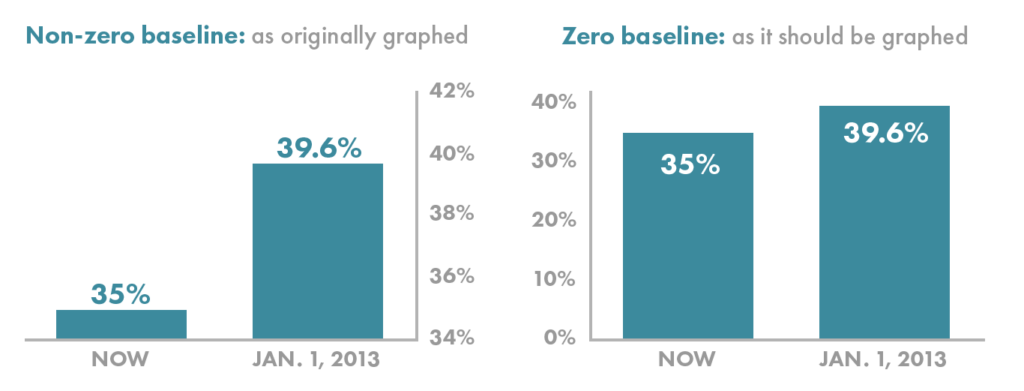
Figure 1 – Nussbaumer Knaflic, C. (2015). Storytelling with data (C. N. Knaflic, Ed.). John Wiley & Sons.
- Average isn’t necessarily the best statistic: The average of a list of data is not always the best statistic, since outliers can skew the distribution in one direction or another. Many everyday datasets typically follow a normal distribution but will deviate to a minimal degree at the very least. Therefore, it’s crucial to always be cognizant of both the mean and median in data viz. If you see a significant difference, this implies the visualization should have a skew, and the underlying assumptions of a normal distribution do not apply to the data.
Leveraging Data Visualization
Some research firms have estimated that the global data visualization market is growing at a CAGR of 9.7% over the forecast period. The emerging nature of data visualization encourages a shift toward analytically driven businesses, where users can explore data in various forms of graphical representation, initially only available in tabular reports on platforms such as Microsoft Excel.
Despite the innovative technology and the clear benefits already being provided by data visualization, businesses are still having difficulties extracting insights from their data due to the shortage of skilled talent in the workforce. Just like any approach or tool in business, data viz has benefits and pitfalls that are important to understand to get the best outcome while mitigating any challenges.
It can be an overwhelming task to take on without having a partner with industry expertise and experience to effectively guide you through your journey of data visualization implementation. If you think your business could benefit from using data visualization, Clarkston’s team of data and analytics experts can help. We offer descriptive analytic solutions using a variety of data viz platforms to turn your data into powerful stories.
Subscribe to Clarkston's Insights