4 Website Design Tips to Drive New Business in 2022

In an increasingly digital world, your organization’s website often serves as a buyer’s first impression of your company. How can you make sure you’re using it to its full potential? Today, we’re laying out our top five website design tips to drive business for your company in 2022.
Website Design Tip #1:
Be Clear and Straightforward About How Your Business Can Help the User
The average user stays on a website for only 10-20 seconds, but websites with a clear value proposition can hold a visitor’s attention for much longer. When designing your website, you must ensure that a user is able to understand what your organization does and the value you can bring within 5 seconds of users opening your site.
When in doubt, less is more. A common saying in design is “sometimes good design is a little design as possible.” While this doesn’t mean that your website should be bare-bones, it does mean you should be intentional about the fonts, colors, and graphics you are using. Brand elements should enhance rather than detract from the experience while helping to guide your user’s eyes as to what they should be focusing on. The highest performing websites often have a large value proposition statement in the top section of the homepage. The text should be big and bold to draw the user’s eye and they should quickly know upon reading it if they’re in the right place. 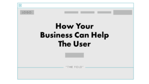
Website Design Tip #2:
Put the Most Important Information Above the Fold
When it comes to website design tips, there’s an old adage that says users won’t scroll far on your website. It’s been recommended that because of this, businesses should make sure to keep everything above the proverbial “fold” of your website, or everything that a user can see when first landing on your page.
While in 2022 we’re definitely seeing more scrolling than ever before, this is still a good rule of thumb, as on average, users still spend about 57% of their page-viewing time above the fold. This is important to think about because even if your potential buyer is in the right place, if they can’t figure that out quickly at the top of your site, they could exit the site before realizing. 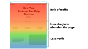
Website Design Tip #3:
Be Efficient with Your Layout
Another key website design tip to keep users on your page and direct them to the information they’re looking for is to make sure your layout and content are as streamlined as possible. Consider what your buyer needs to know, and how to make sure that’s where their focus is directed.
A number of eye tracking studies have been conducted over the years that analyze the patterns in the way the average person consumes information from webpages. These studies have found that people are often pretty predictable when it comes to browsing and absorb content in a matter of seconds, following an “F” shape. When landing on a page, users first scan the page from left to right, then they’ll go back to the left side and scan in a downwards direction. Finally they’ll follow a second horizontal movement, return back to the left side and continue down the page.
Businesses who want to make the most of human behavior and use their website real estate efficiently should take advantage of these common scanning patterns and arrange important elements on their sites accordingly.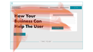
Website Design Tip #4:
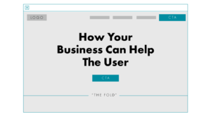
Be Thoughtful with Calls to Action
Finally, use calls to action (CTAs) with intention. Let’s say your potential buyer likes your value proposition, they understand who you are and what you do, how do you get them to take that next step?
Effective CTAs are your answer. When creating a strong CTA, be sure to keep the text on the shorter side, and use language that creates a sense of action and urgency with the user. Be clear about what will happen when the user clicks the button. Are they registering or subscribing for something? Are they learning more? Using words like “now” and “immediately” make users feel like there is time attached to the offer, and they should act more urgently.
Placement is also key when getting high click rates on CTAs. Users will often look to the top right for an action or in the top hero section above the fold.
Going Forward
As your organization considers your business goals for 2022, leaders should not discount the impact that implementing a few website design tips can have on your bottom line.
Subscribe to Clarkston's Insights